A digital planner is a versatile tool that can help you stay organized and productive. But one of the most important aspects of a digital planner is the font you use.
The right font can make your planner look stylish and professional, while the wrong font can make it difficult to read and use.
In this guide, we will discuss the factors to consider when choosing a font for your digital planner, as well as some of the best fonts for different types of planners. We will also provide tips for using fonts in your digital planner to create a stylish and functional space.
Why is choosing the best font important for a digital planner?
Choosing the right font for a digital planner is crucial for several reasons:
Readability and Accessibility: The primary purpose of a digital planner is to provide information and facilitate organization. The right font enhances readability, ensuring that users can easily absorb the content without straining their eyes. This is especially important as digital planners are often accessed across different devices and screen sizes.
User Experience: Fonts contribute significantly to the overall user experience. A well-chosen font can create a pleasant and inviting environment, while a poorly chosen one can lead to frustration and disengagement. The right font can establish a connection with users, making them more likely to engage with the planner.
Visual Consistency: Fonts play a role in maintaining visual consistency within the planner. Consistent font choices across headings, subheadings, and body text give the planner a polished and professional look. This consistency aids users in navigating through the content seamlessly.
Brand Identity: If the digital planner is associated with a brand or theme, the choice of font can reflect and reinforce that identity. Consistently using fonts that align with the brand’s style guide or theme helps build brand recognition and strengthens the planner’s identity.
Emotional Impact: Different fonts evoke different emotions. A playful font might suit a creative or whimsical planner, while a sleek and elegant font could be perfect for a professional or minimalist design. The right font can set the mood and tone of the planner, enhancing its overall impact.
Differentiation: With countless digital planners available, using unique and appropriate fonts can help your planner stand out from the crowd. A distinctive font choice can attract users who resonate with your planner’s style.
Aesthetic Appeal: Fonts are an integral part of the planner’s visual design. They contribute to the overall aesthetics and contribute to making the planner visually appealing. The right font can elevate the planner’s design and make it more engaging.
Communication of Information: Fonts not only convey the content itself but also help communicate the hierarchy of information. Clear differentiation between headings, subheadings, and body text guides users through the planner’s content flow.
What are the factors to consider when choosing the best font for a digital planner?
There are many factors to consider when choosing a font for a digital planner, but some of the most important include:
Legibility: The font should be easy to read, even in small sizes. This is especially important if you plan on using your planner on a digital device with a small screen.
Purpose: What will you be using your planner for? If you need a font that is clear and concise for jotting down notes, a sans-serif font would be a good choice. If you want a font that is more decorative and eye-catching, a serif font might be a better option.
Branding: If you have a specific brand or theme for your planner, choose a font that reflects that. For example, if your planner is for students, you might choose a font that is playful and fun.
Personal preference: Ultimately, the best font for you is the one that you like the best and that makes you feel inspired to use your planner.
Free and premium fonts for digital planners
Sure, here are some free and premium fonts for digital planners, with a short description of each:
Free fonts:
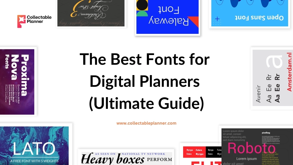
Lato: A sans-serif font that is clear and modern. It is a good choice for jotting down notes or creating to-do lists.
Roboto: Another sans serif font, Roboto is also highly legible and versatile. It can be used for a variety of purposes, from writing long passages to creating headings and titles.
Open Sans: A sans serif font that is similar to Lato and Roboto, but it has a slightly more casual feel. It is a good choice for planners that are meant to be used for everyday tasks.
Raleway: A serif font that is elegant and sophisticated. It is a good choice for planners that are meant to be used for special occasions.
Avenir: A sans serif font that is also quite elegant, but it is also more modern than Raleway. It is a good choice for planners that are meant to be used for work or school.
Lobster (Google Fonts): A playful script font with a casual and handwritten appearance, perfect for adding a touch of creativity to your digital planner designs.
Quicksand (Google Fonts): A rounded, geometric sans-serif font that offers a friendly and approachable feel, making it ideal for headers and section titles.
Pacifico (Google Fonts): A whimsical and distinctive script font that adds a touch of informality and creativity to your digital planner’s headings.
Montserrat (Google Fonts): A versatile sans-serif font inspired by the urban typography of Montserrat, Spain. It’s great for clean and professional-looking digital planners.
Premium Fonts:
Avenir Next (Linotype): A premium sans-serif font is known for its clean lines and modern design. Its wide range of weights makes it suitable for various elements within digital planners.
Proxima Nova (Typekit): A contemporary sans-serif font that offers excellent readability. Its elegant design makes it perfect for both headers and body text in digital planners.
Futura PT (Monotype): A geometric sans-serif font with a timeless and modern appearance. Its strong presence makes it well-suited for titles and headings.
Bickham Script Pro (Adobe Fonts): A premium script font that emulates elegant handwriting. It adds a touch of sophistication to headings and special sections in digital planners.
Garamond Premier Pro (Adobe Fonts): A classic serif font with a rich history. Its timeless design lends a sense of tradition and elegance, making it ideal for body text in digital planners.
Tips for choosing the right fonts for your digital planner:
Consider Readability First: Prioritize readability above all else. Your chosen fonts should be clear and easy to read, even in smaller sizes. Avoid overly decorative or complex fonts that might hinder legibility.
Match the Theme: Align your font choices with the overall theme and purpose of your digital planner. A playful font might work for a creative planner, while a more professional font could be suitable for a business-oriented planner.
Maintain Consistency: Stick to a limited number of fonts (usually 2-3) throughout your planner to maintain visual consistency. One font can be used for headings, another for body text, and possibly a third for special elements.
Contrast for Hierarchy: Use font contrast to establish a clear hierarchy. Pair a bold or larger font for headings and a lighter font for body text. This helps guide the reader’s attention and makes your planner more organized.
Pair Complementary Fonts: When choosing multiple fonts, ensure they complement each other. Pair a sans-serif font with a serif font or a script font with a simple font for an attractive contrast.
Test for Screen Devices: Remember that your digital planner will be viewed on various screen sizes and resolutions. Test your chosen fonts on different devices to ensure they retain their readability.
Consider Emotions and Tone: Fonts carry emotional associations. Choose fonts that evoke the right emotions and match the tone you want to convey. Playful fonts for fun planners, professional fonts for serious planners, etc.
Stay Timeless: While trendy fonts might be appealing, consider fonts that will remain relevant over time. Avoid overly stylized fonts that might become outdated quickly.
Test Variations: Experiment with different font weights (bold, regular, light) and styles (italic, underline) to create emphasis and variety within your planner.
Avoid Too Many Decoratives: While decorative fonts have their place, avoid using them excessively. They’re best suited for accents or titles rather than body text, which could become overwhelming.
Check Licensing and Usage: Ensure that the fonts you choose are properly licensed for your intended use. Some fonts might have restrictions on commercial usage or require attribution.
Personalize with Branding: If the digital planner is for a brand or business, consider using fonts that align with the brand’s existing typography to create a consistent identity.
Ask for Feedback: Show your font choices to a few people and gather feedback. Sometimes, others might spot issues or have suggestions you haven’t considered.
Experiment and Revise: Don’t be afraid to experiment with different fonts during the design process. Revise and refine until you find the perfect combination that suits your planner’s aesthetics and function.
Conclusion
Choosing the right fonts for your digital planner is an important decision. The fonts you choose will affect the overall look and feel of your planner, as well as its readability. By following the tips in this guide, you can choose fonts that are both stylish and functional.
Here are a few key takeaways from this guide:
- Consider the purpose of your planner when choosing fonts.
- Choose fonts that reflect your personal style.
- Experiment with different fonts until you find the ones that you like the best.
- Make sure the fonts are legible.
- Use a consistent font style throughout your planner.
- Don’t overdo it with the fonts.
With a little thought and effort, you can choose the perfect fonts for your digital planner and create a planner that you will love using.
I hope this helps!


